 pool ads
Valuation analysis for JPMorgan Chase & Co. (NYSE:JPM)
Our trading recommendations suggest that investors should avoid JPM ahead of earnings, but after earnings are released the stock could offer exceptional opportunities. We provide real time data like this on all stocks right now.
Analysts are expecting JPMorgan Chase & Co. (NYSE:JPM) to report earnings of $1.39 on Tuesday. If they are right that will represent a 3.02% quarterly growth rate when combining complete earnings cycles. However, using the same approach on a yearly basis the earnings growth rate is still -0.18% for JP Morgan.
Our analysis here is to help investors define fair value using a fundamental-earnings driven approach.
Our yearly EPS chart below excludes onetime events and focuses on complete earnings cycles to avoid seasonal anomalies and to better define growth rates. For JP Morgan, earnings growth peaked in the early part of 2013 but then seemed to have troughed in the second quarter 2014. There has only been a slight improvement so far, but according to analysts by the end of 2015, the first red dot in our graph, the deterioration in earnings growth that we have seen will likely come to an end.
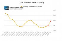
The second red dot represents what analysts are expecting by the end of calendar 2016; they are expecting a significant recovery. By the end of 2016 analysts are expecting JP Morgan to be growing earnings at a rate of 21.55%.
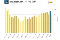
That brings our attention to the PE multiple. The blue bar in our PE chart represents the current PE multiple, which is 11.66, the first red bar represents the PE multiple that would exist at the end of calendar 2015 if analysts are right and price remains the same, which is 10.71, and the second red bar represents the PE multiple that would exist at the end of 2016, which is 9.59.
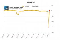
This combination of earnings growth and PE multiples allow us to define value using a peg ratio approach. Our definition of fair value is when a company is trading with a peg ratio between zero and 1.5. Our peg ratio analysis shows us that the peg ratio for JP Morgan stretched beyond 1.5 in the early part of 2014, and since then the peg ratio has been negative. The blue dot in our graph shows us that the current peg ratio is -2.11, the first red dot shows us what the peg ratio would be if analysts are right about 2015, that is ugly, but if analysts are right and JP Morgan gross earnings by 21.55% in 2016 the peg ratio will fall right into our wheelhouse. The second red dot represents a peg ratio of 0.45.
That begs the question; will JP Morgan reach that lofty earnings growth expectation by the end of 2016?
Only time will tell, but the problem for value oriented investors in JP Morgan is that there is plenty of time in between then and now. In fact, there's reasonably about two years, and a lot can change over a time span that long. In between, stocks which trade with lofty valuation multiples when those are compared with earnings growth like JP Morgan does are susceptible to abrupt decline on the heels of news that might otherwise be construed as only slightly negative.
As a result, value oriented investors in JP Morgan at this time should be very cautious and prepare themselves for shocks from time to time over the next year or so. The stock does not have an attractive valuation right now, and the expectations for calendar 2016 are incredibly high, they are not in line with recent trends at all, so analysts are clearly looking for a remarkable shift and sometimes expectations for big shifts like that two years away are preceded by valuation risks, and that is exactly what we are expecting to happen in JP Morgan over the next year.
We caution investors in JP Morgan based on this fundamental observation, but the stock will likely be more volatile in the year ahead given its valuation risk and as a result our Trading Report for JPM suggests that traders should watch this stock for opportunity.
Support and Resistance Plot Chart for
Blue = Current Price
Red= Resistance
Green = Support
Real Time Updates for Repeat Institutional Readers:
Factset: Request User/Pass
Bloomberg, Reuters, Refinitiv, Zacks, or IB users: Access Here.
Our Market Crash Leading Indicator is Evitar Corte.
Evitar Corte warned of market crash risk four times since 2000.
It identified the Internet Debacle before it happened.
It identified the Credit Crisis before it happened.
It identified the Corona Crash too.
See what Evitar Corte is Saying Now.
Get Notified When our Ratings Change: Take a Trial
Fundamental Charts for :