 pool ads
We sold ProShares Ultra QQQ (ETF) (NYSEARCA:QLD)
Last week I issued an article that talked about my conditionally positive bias based on the test of longer term support levels that happened in the market in prior weeks, our Strategic Plan strategy is holding DDM for example, and I alluded to risk controls that we incorporate into this strategy but I did not go into detail about those risk controls. Given what has transpired this week so far I believe it is important to do so.
First of all, our Swing Trading strategy, which was double long the NASDAQ from last week using ProShares Ultra QQQ (ETF) (NYSEARCA:QLD), sold that position and reverted to cash on Tuesday. There is a material difference between this Swing Trading strategy and our Strategic Plan strategy, however, and that is that the Swing Trading strategy has a much shorter duration. Where our Strategic Plan strategy might hold a position for a few months, our Swing Trading strategy averages a few days, but there's more. The Swing Trading strategy is governed by shorter term durational chart patterns whereas the longer-term strategy, the Strategic Plan strategy, uses longer term chart patterns exclusively.
It is these that I want to discuss because these longer term chart patterns are what provide us with a risk controls I alluded to in my article from late last week.
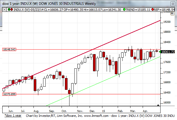
Our entry levels for the position we are holding now in the Strategic Plan strategy are much lower than where ProShares Ultra Dow30 (ETF) (NYSEARCA:DDM) is today and that is because the support line of the upward sloping trend line in the longer-term chart patterns demonstrated below were tested when the market was much lower as well.
However, the aggressively sloped upward sloping channel that is defined by the green upward sloping trendline and the parallel resistance line in our longer-term chart pattern of the Dow Jones industrial average, for example, increases every day. That means that support levels increase every single day and overtime support levels will be much higher than they were in the past.
To be specific, the entry levels in our Strategic Plan strategy happened somewhere near 17,600 in the Dow Jones industrial average, when that upward sloping support line began to be tested at the end of March. Over time that level has increased and now the upward sloping support line exists at 17,900.

The reason I am offering this updated article is to reveal that risk control.
Although our position was established at lower levels we absolutely will sell it if our support line breaks. We have adjusted our profit stop to reflect what price would be if that support level breaks and if we are stopped we therefore are likely to secure a small gain from our position because of the higher levels that we have witnessed, but in addition to that we may, by rule, also engage the short side of this market using ProShares UltraShort Dow30 (ETF) (NYSEARCA:DXD) if the rules are satisfied.
On Tuesday the dow Jones industrial average came very close to this level so it was, I felt, important for me to update my risk controls based on the article I offered last week, but I might add that the Russell 2000 looked extremely ugly on Monday and because it has been such a leader until recently but the weakness in the Russell 2000 should be duly noted.
In summary, the Strategic Plan strategy at Stock Traders Daily, at least at the time I wrote this, was still long the Dow Jones industrial average by rule because support lines were still holding, but if they break that can change. I clearly will not reveal all of these details every time the Strategic Plan makes a trade in the future, doing this in article format is clearly not efficient, but you can clearly see from the graph I have provided that if the upward sloping support line breaks there will be substantial opportunity on the downside as well. The ability or the inability of the market to hold support is the key, thus far support is holding, but it is our inflection level and will continue to be.
Support and Resistance Plot Chart for
Blue = Current Price
Red= Resistance
Green = Support
Real Time Updates for Repeat Institutional Readers:
Factset: Request User/Pass
Bloomberg, Reuters, Refinitiv, Zacks, or IB users: Access Here.
Our Market Crash Leading Indicator is Evitar Corte.
Evitar Corte warned of market crash risk four times since 2000.
It identified the Internet Debacle before it happened.
It identified the Credit Crisis before it happened.
It identified the Corona Crash too.
See what Evitar Corte is Saying Now.
Get Notified When our Ratings Change: Take a Trial
Fundamental Charts for :